
Motivation
Why did I call this Richard Koroll Imagery and not photography? The reason is that imagery is not necessarily the reality that pure photography represents. Here you will find examples of images representing both photographic reality as well as examples of how I, as an artist, interpret a subject.
I use the process of photography to start. A camera is merely a photographic tool, not an end in itself. Just as a furniture maker uses a table saw and other tools to construct a fine piece of work, so do I see the camera, lights and software as a means to construct a fine image. To me, the camera only captures the start of my vision.
What I like to impart into an image is emotion that exists only during an instant of time. I using various lighting techniques, either natural or artificial to start the creation off. I process that image until I get just the result I had in mind, such as modifying the existing photograph, making the image look like a drawing, a faux painting or something totally abstract. I like to imbue the final image with a good sense of depth and impact using various techniques. I avoid using “one click” apps or actions as much as possible, preferring to use my own editing techniques to achieve the results.
I then take the resulting digital image and print it to my specifications, using my own professional printer and various papers to get the exact texture I was looking for. These professional papers are not necessarily found in big box stores, nor are the pigmented inks, (commercial, everyday printers use chemical processes) so each image I print has a unique texture and look.
My hope is to create something unique that cannot be fully appreciated in the digital world, but must be seen in print to see, and experience, the full artistic effect.
Digital vs Reality
What you see as a digital image on your computer screen or phone does not truly represent the emotion contained in a finished print.
Why are artistic prints still important in this digital age? For each print I select a type and style of paper that best enhances the feeling that I want to impart. For example, I will use a rough matte to simulate a water colour painting, a high contrast, glossy sheen for metallic finishes, a canvas for Giclée paintings, or any one of a dozen different mediums available to get just the effect I want to express. I have had people who were sure that a print was actually a water colour or pencil drawing as opposed to actually being printed. A well created print beats a digital image everytime.
You may ask, can you get just digital images? Yes, you can. They cost the same as a print (as I do the same work on them) and if you get them printed elsewhere, there is no guarantee of what they will look like.
My Art Prints
Images less than 16×20 I typically print myself. Larger images are from labs that sell only to businesses and which print the image in the manner I want. I do not use large box stores for cheap prints.
My Art images are limited in printings, I do not get hundreds of duplicates printed. I appreciate the understanding used by paintings, only one original painting exists, therefore my Original Series are in the very low numbers, sometimes I only print two, one for me and the other for a client. Each one is signed and numbered. I mark the original’s of any series as “Series 1, Original, 1 of _ , printed by Richard Koroll”, with the date of printing. Subsequent images, if printed and no matter the size, are marked as “Series 2, Copies, printed by Richard Koroll”. There is at most, only two images printed that I consider originals.
Due to variations in inks, paper lots, printer settings, screen calibration and my mood a the time, I believe that only the images printed at that initial printing are the originals. Once I have finished printing the image, all these variables change and I believe subsequent prints are not reproducible.
The inks I use in printing are particle based inks, not dyes or chemicals, and are good for several decades or two hundred years as mentioned by the manufacturer.
For framed and mounted works I use Made In Canada solid wood framing and archive, museum grade matting.
Your Images and Prints
I take the same care when creating your prints as I do with my Art Prints. I use the same techniques and printing logic. For images other than what I print, I use high quality photographic labs that I believe can reproduce the image in the manner that I am looking for.
You may ask, am I able to get your image in the latest, trendy print? Yes. I have access to everything offered, from prints, metals, to acrylic coverings. You name it, and I can get it. During our initial interview we can discuss why and where you are looking to show off your image.
And yes, you can see the difference in a quality print versus a retail store.
Is a Studio really necessary?
Depends on what you want to do.
When needed, I use full sized, professional studio equipment to produce the powerful studio style lighting that gives solid blacks and pure whites. These can be set up relatively anywhere, including a front room, basement or outside. If you can tell me all the portrait images on my Welcome page that I took outside of an actual studio I’ll include an additional small print for you.
If we need a studio, I find that it is easier to rent one than to keep one. One of the reasons to rent is how much space do we need to shoot what you want? Additionally, we can rent hotels, B&Bs, parks and other places as needed.
Personal Background
I have gone the route of the cliché, self taught at an early age, had my own darkrooms, took many photography classes and exposed a lot of film to enhance my skills and learning while pursuing wet photography as a hobby. In the meantime, I worked in IT and eventually became a Project Manager at a large telco.
When the transition to digital photography took place, I was more than overjoyed and immediately leaped onboard. I opened a studio for a while then discovered that the photography I took was mostly on location.
I supplemented my education over the years through various professional courses and organizations, completing a digital photography certificate course at Humber College to refresh and learn about the new digital techniques in cameras and software.
I have contracted for local newspapers and operated a studio, 3 Oaks Photography Inc, where I photographed Corporate Head-shots, Family Portraits and Weddings for a number of years. Today I no longer own a studio and prefer to shoot on location, rented spaces or in private homes.
I do not shoot with all the paraphernalia of a movie or commercial studio. I consider myself in the style of a painter, they can get a lot done with just some brushes, canvas and an idea.
Art Works and Images have appeared at:
-Artworld Fine Art on Evans Ave.
-A photograph of a painting appeared on the cover and inside pages of Arabella, a national arts magazine.
-Real Estate images have appeared in an edition of Toronto Life
–a book of prints were on display at “Prints Charming” on Roncesvalles
-“Union Station”, appeared in episode 0508 of the Canadian TV series “Flashpoint”.
-the Riverdale Art Walk and local establishments through the Artists Network in Riverdale
-Mel Lastman Square Artwalk
-Smith Zone, juried shows, “In the Eyes of the Artist”
-Lakeshore Arts (Mimico)
-Reba’s Coffee Shop, general showing
-Reba’s Coffee Shop, Contact 2008
-European Art Attack on the Lakeshore.
About my image:
Once upon a time I had a studio where I did personal and family shots, head shots and model portfolios. I also had a few interns from time to time from local schools who needed some photographic experience. They were there as part of a work experience and remained for a whole term.
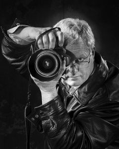
The image above, is not, according to some people, a mirror shot. None of the letters are reversed on the camera or lens barrel. What it is though, is a shot from one of my interns. I showed her how to light the image using studio lights for the subject and small flashes to highlight inside the barrel of the lens. Obviously, she had the “eye”.
For those of you who think that it is the equipment that matters, this was shot using an inexpensive Rebel T3 and a standard kit lens as a jpeg image. I have touched it up, but it is one of the better images of me that I have. I also use a color version of this image on my business cards.
This particular intern did get into Ryerson and another intern of mine is now working with a Toronto advertising company.